
6 minutes
Beautiful UI
What makes an app great? A novel idea, a day-to-day problem that it solves elegantly, a smooth user experience, a beautiful interface.
A beautiful interface.
What is “beautiful”? How do we grasp that intuition and put it into something that we as designers and developers can implement in our apps?
In this post, I want to explore a number of things that I found make
me stumble when I use an app.
Things that I now watch out for when building an app.
Things that I go to my company’s designers to complain discuss about.
Things that I open issues and PRs with open source projects on Github for.
Basically, I describe a number of characteristics that a Beautiful UI has.
Disclaimer:
Firstly, I am not a designer. I have no clue about the concepts and structured approaches they teach in design school. I am writing this from the view of a user with a very keen eye, very high standards and a background in Android development.
Secondly, the last thing I want to do is to point fingers. The (anti-)examples I give are to illustrate. We simply learn more from our errors than from the things we already do right.
Lastly, I am biased towards Android, since this is what I know most about. However, the general rules should equally apply to other platforms.
Rule 1: Stick to the guidelines
Design systems exist for a reason: to provide a consistent set of rules how things are to be done, and to save us time since a lot of design problems are already solved for us.
Material Design is the go-to choice for many Android apps. It contains a huge list of building blocks that we can use to build an app, allowing us to create a consistent and beautiful experience.
Choose a design system, and then stick to its guidelines. Be consistent. Not doing so gives the user the impression that we don’t really care about our brand’s appearance after all.
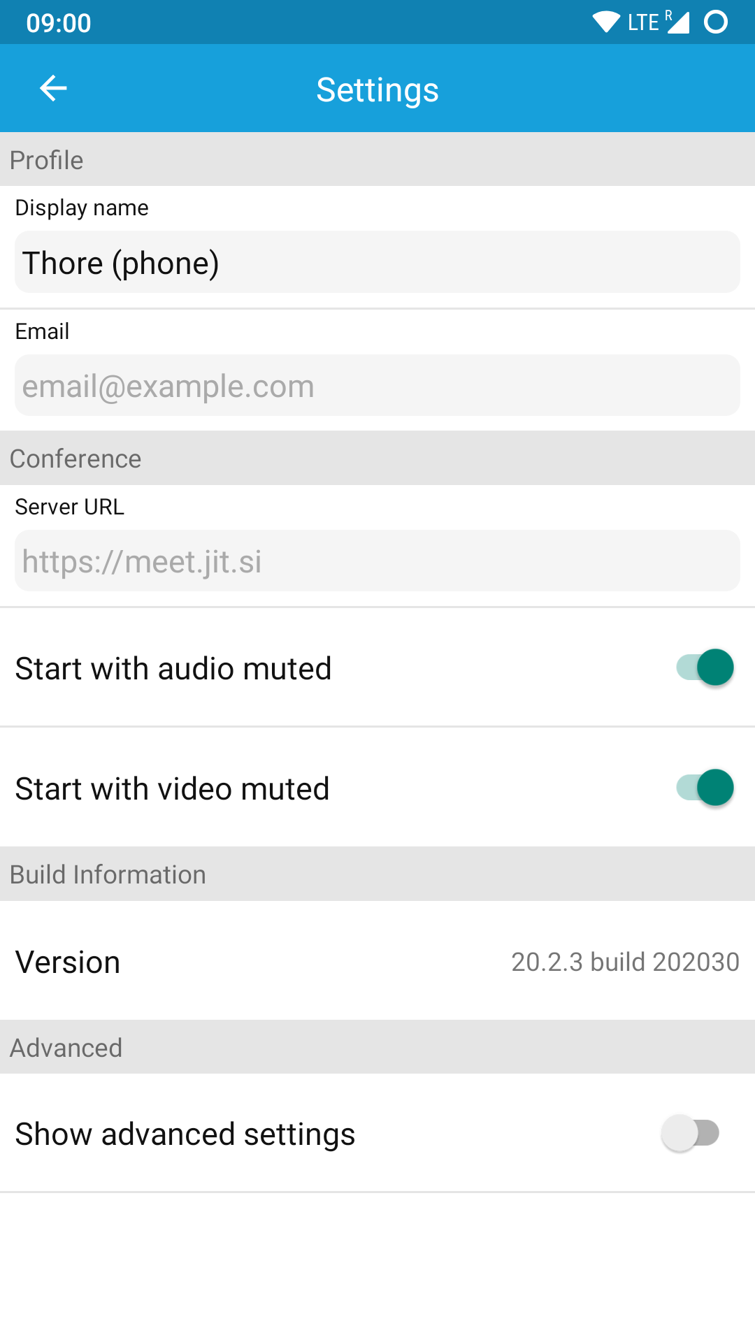
For example, Material defines how an app bar should look like. Jitsi however does not adhere to that. First, the app bar height is too small – notice how the space to the left of the back arrow is greater than the space below it. Second, the title is centered, whereas in Material for Android it should be left-aligned.
Another issue here is colouring: if we define a primary brand colour, we should use it everywhere. The ugly default green on the switches does not go well with the blue.
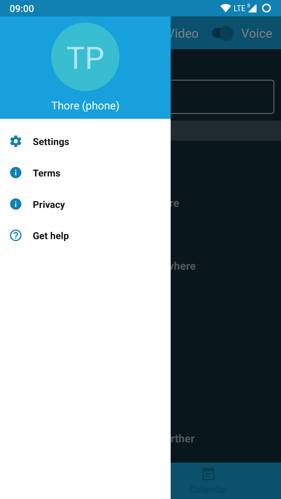
Jitsi also provides us with an example of a modal navigation drawer, colloquially known as the “hamburger menu” (since it hides behind a button that vaguely looks like a hamburger). To be fair, the Material specs are not particularly helpful, as they imply that (on a phone) the drawer should always take the full width minus the size of the app bar. Not even Google does this with their own apps, and there are various different articles discussing what might be the right width. Anyway, the width that Jitsi uses is far smaller than what anybody else uses. This break with practical Material Design is distracting.
Icons need to be consistent, too: ProtonVPN uses an old Holo icon amidst their Material-themed app (but hopefully not for much longer!).
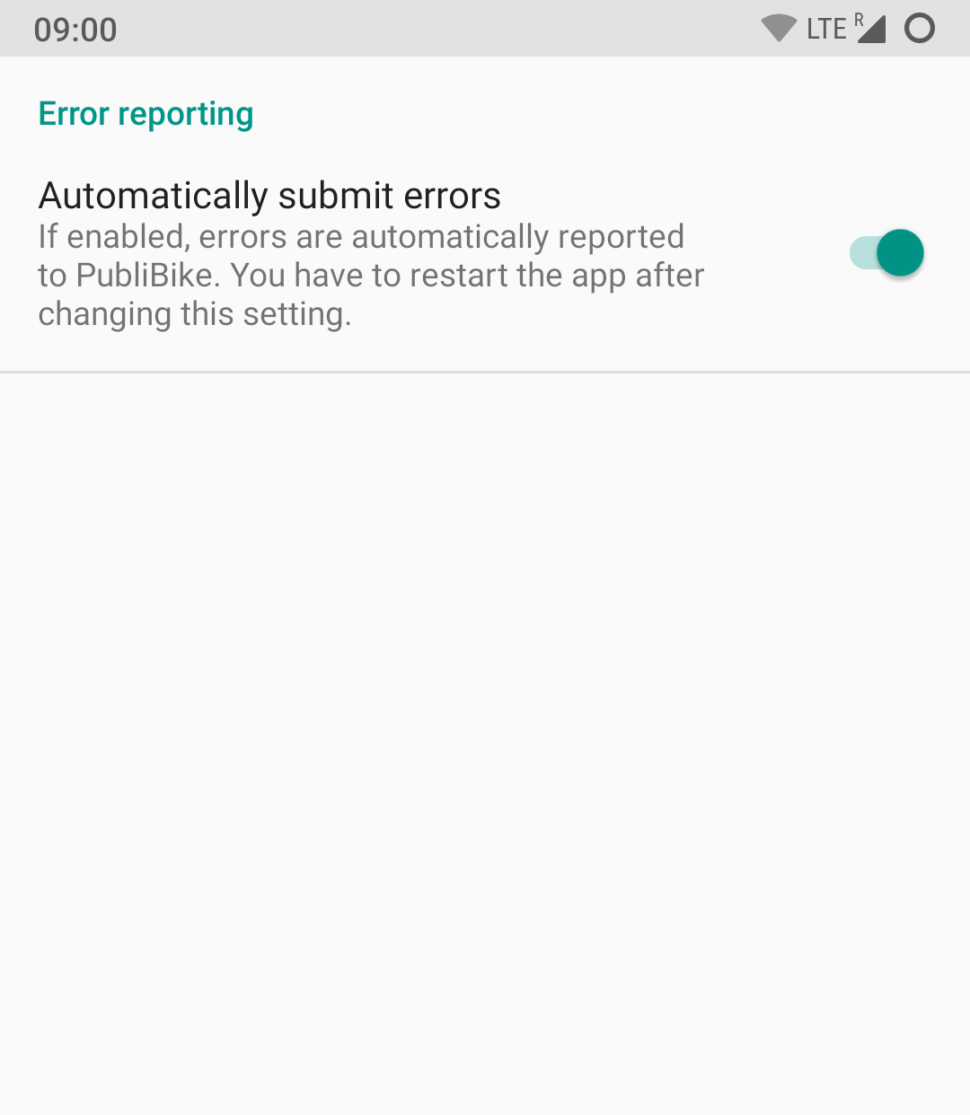
Finally, leaving random, unthemed and seemingly unfinished screens in our app is not just not beautiful. It’s ugly. This is an actual settings page from the Publibike app: in the default Android theme, without any app bar or back button.
Stick to the guidelines. Everywhere.
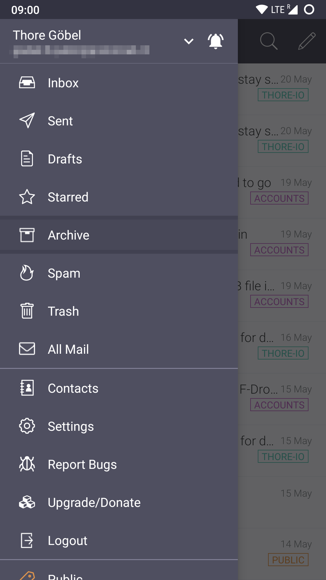
To end on a good note, I would like to point out two apps that have done an awesome job in encorporating the latest Material Design: this files app and Threema. Case studies of well-executed and more custom design systems can be found with Slack, ASVZ and SwissCovid.
Rule 2: Be responsive
By “responsive” I mean fast, not skipping animation frames, lagging, or jumping around. This rule concerns the dynamic aspect of our interface.
Lack of responsiveness quickly results in the user experience being consciously or subconsciously worsened.
Most often this happens to apps that are not native to Android, but written in some cross-platform framework like React Native or Cordova. This is not to say that we cannot build responsive apps with them, but we need to go to greather lengths to achieve that. One cross-platform framework for which this is not true is Flutter, at least in my experience so far. I am yet to see a non-responsive Flutter app.
Rule 3: Have touch states
Touch states are the difference between interacting with a panel of glass and interacting with something natural and beautiful.
It doesn’t matter whether it’s the classic default-hover-focus-press state list or the animated Material ripple effect. I believe that touch states contribute a great length to an app feeling “native”, “fluent” or “responsive”. In web apps the effect is even stronger: distinct hover states make the app feel much more “native”, even though it only runs in the browser. Thus touch states are closely related to responsiveness, but deserve to be considered on their own.
Unfortunately, there are numerous examples where touch states are missing. I’m sure you’ll find some in an app near you. If the user can click it and it does something, it needs a touch state.
When they are present, however, touch states should be a single colour. Not two, like in this example:
Rule 4: Align and pad
Consistent alignment gives an app a structured appearance. Malaligned items on the other hand make the app look messy and cluttered.
This effect is increased by too little padding. Remember Jitsi’s settings screen from above? Everything is crammed together, making texts harder to read and sections harder to differentiate at first glance.
One alignment example from ProtonMail:
And a very subtle centering example from Threema:
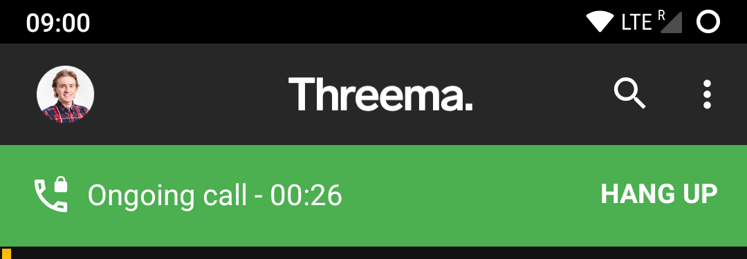
Subconsciously, something in the green header feels odd. It is only when we turn on layout bounds in the developer tools, that we see that the white content is top-aligned instead of being aligned to the horizontal center line:
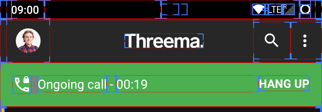
Knowing this, it is easier to see (in the original image) that the green space above Hang up is smaller than the green space below. It’s like the arrow in the FedEx logo: once you know it, you can’t stop noticing it.
Summary
In this post, I described a number of points that I found to be common pitfalls when giving an app its final polish. I gave a few examples that I learned from and that continue to help me in not making the same mistakes.
These points complement Clean Code: just like Clean Code should be elegant, Beautiful UI should be delightful. Just like Clean Code should be pleasing to read for the developer, Beautiful UI should be pleasing to look at for the user.
Beautiful UI can be summarised in four rules:
- Stick to the guidelines
- Be responsive
- Have touch states
- Align and pad
Listing those is easy. Implementing them is hard.
1173 Words
2020-05-23 17:00 +0000